
Myres CPA
Website visual direction and UI design for a strategy-first CPA firm based near San Antonio, Texas.
Project overview
Myres CPA is a Texas CPA firm founded by Trevor Myres. It was legally formed in November 2021 and opened on 1 January 2022. The firm works with small and mid-sized business owners in construction and the trades, family-owned businesses, and high-income earners with side ventures or real estate. It has clients in more than 20 states.
In 2025 WISE Digital Partners rebuilt the firm’s website. I was one of the designers on the project. I worked on the visual direction, the imagery and the page layouts across the site, from the homepage through the service pages and the pricing calculator. The sitemap and all page copy came from WISE’s copy team.
The brief
Summarised from the client’s Stakeholder Brief (May 2025) and Brand + Goals exercise, both completed with WISE before the build.
“Tax is the tool; transformation is the goal.”
What the client needed
The firm is moving toward recurring advisory work instead of one-off compliance. Until now digital marketing had been an afterthought and new clients came through referrals. The previous site had a simple, editorial look. The client described it as a general template with repeated copy and little personality, and asked for a clearer service breakdown, team bios, case studies and FAQs.
Goals the client selected
How they want to be seen
Trustworthy, professional, intentional, supportive, straightforward, confident, efficient.
Design input
Colours: navy blue, described as “grounded and trustworthy”. Type: clean, modern, readable sans-serif. Sites they admired: Full Send Finance for its pricing page, Dark Horse CPAs for its messaging, Badger CPA and Dillon Business Advisors.
Constraints
Keep the existing logo, which the client called “functional, but open to refinement”. No brand guidelines existed. The site had to link to the Canopy client portal, plan for Calendly scheduling and support a CMS blog. The sitemap was approved on 19 June 2025.
Creative direction
Branding status: existing brand, elevated. From the previous website, only the colour palette was kept. The typography, imagery, graphic elements and page layouts were created by us, the WISE design team. The client’s mountain-in-a-circle mark and “Advisory | Tax | Wealth” lockup stayed as the logo, and with no written brand guidelines, the new visual identity was built outward from it.
Clarity at altitude
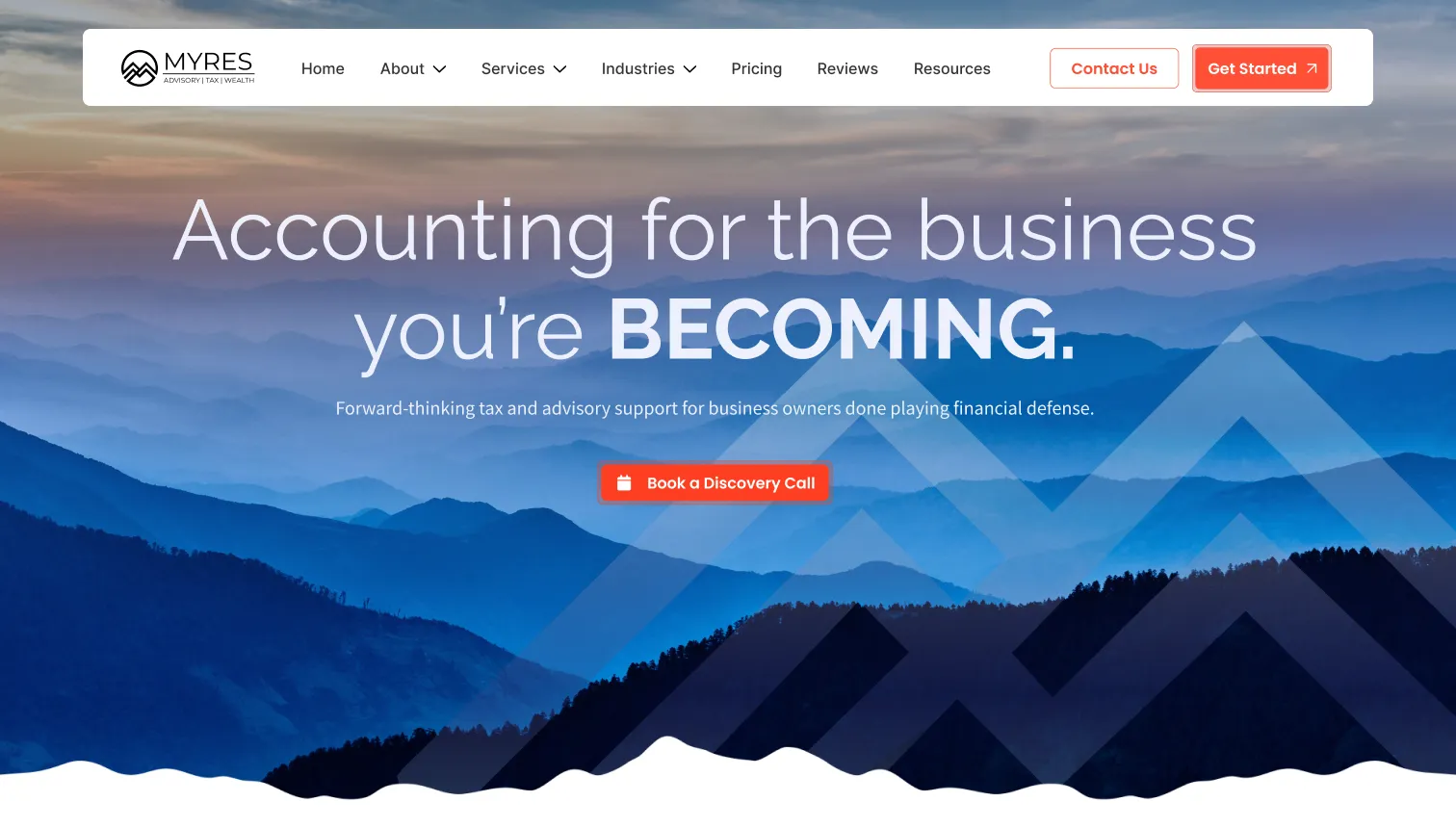
The logo is a mountain, and the brief keeps returning to clarity, confidence and control. The direction treats financial planning as a view from higher ground: layered ridgelines, open horizons and a long line of sight. Deep navy carries the trust the client asked for. A single bright orange is reserved for actions, so the next step on every page is easy to find.
The concept name was written for this case study to describe the direction.


Visual Identity
Project imagery, licensed from Adobe Stock

Compass: direction and a decision in hand

Pier: a clear, calm path forward

Open road: long-term planning

Layered ridgelines: the main landscape for the hero and closing panel

Gradient with M silhouette: background texture drawn from the mark
Colour
Values sampled from the Visual Identity Card.
Type, graphics and imagery
- Type. Raleway for headlines and Source Sans Pro for body text: clean, modern sans-serifs, as the client asked. Headlines pair Raleway Light with one word set in Bold capitals (“you’re BECOMING.”, “BEGINS HERE”), so a single word carries the emphasis.
- Graphic elements. A large double chevron taken from the M in the logo sits over the homepage hero. A ridgeline edge closes the hero bands and echoes the peaks in the mark. Photographs are framed with one rounded corner. Icons are outlined in navy with an orange detail.
- Imagery. Mountain and horizon landscapes for the brand story. San Antonio’s skyline and River Walk for local and service pages. Engraved-style portraits for the team. All photography is licensed from Adobe Stock.
Forward-thinking tax and advisory support for business owners done playing financial defense.
References the client named
Design exploration
These sketches were drawn after the project, working back from the final homepage, to show how its structure could have developed. They are a reconstruction, not working files from the July 2025 sprint.
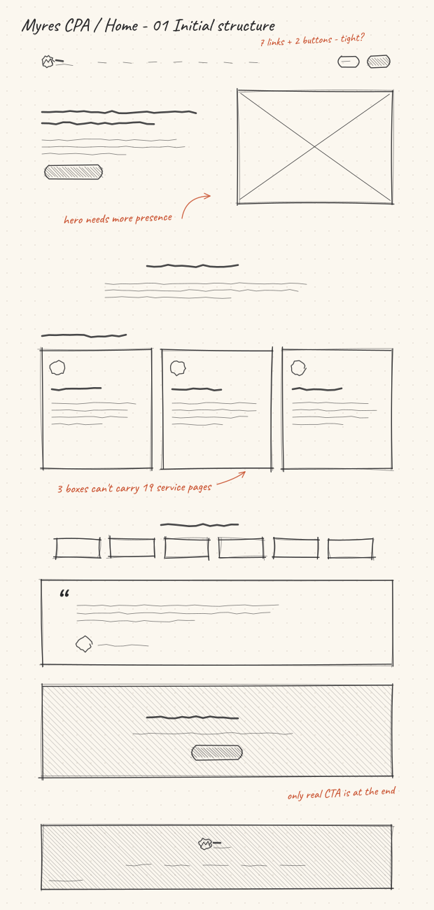
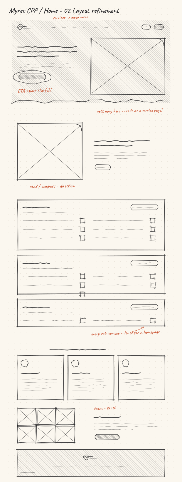
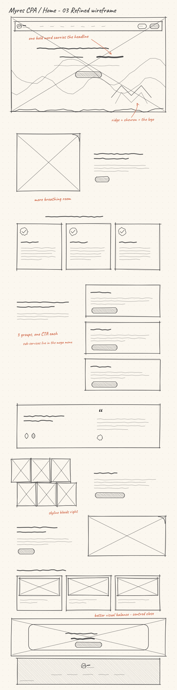
Hero layout alternatives
RECONSTRUCTED DESIGN EXPLORATION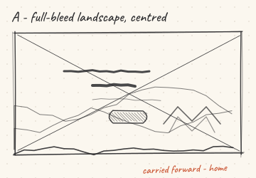
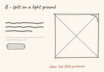
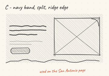
A full-bleed landscape with a centred headline gives the homepage the most presence and leaves room for the chevron graphic. This is the structure the final homepage uses. A split layout on a light ground reads clearly but has little presence. The navy band with a split layout suits a more local, service-led page and was used on the San Antonio page.
Service presentation alternatives
RECONSTRUCTED DESIGN EXPLORATION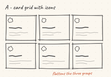
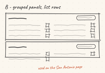
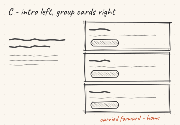
The approved sitemap groups the services into Business Services, Planning & Advisory and Individual Services. A card grid flattens those groups. Grouped panels with list rows show every sub-service, which suits the San Antonio page. On the homepage, a short introduction on the left with one card per group on the right keeps the three groups clear, each with its own call to action.
UI/UX design execution
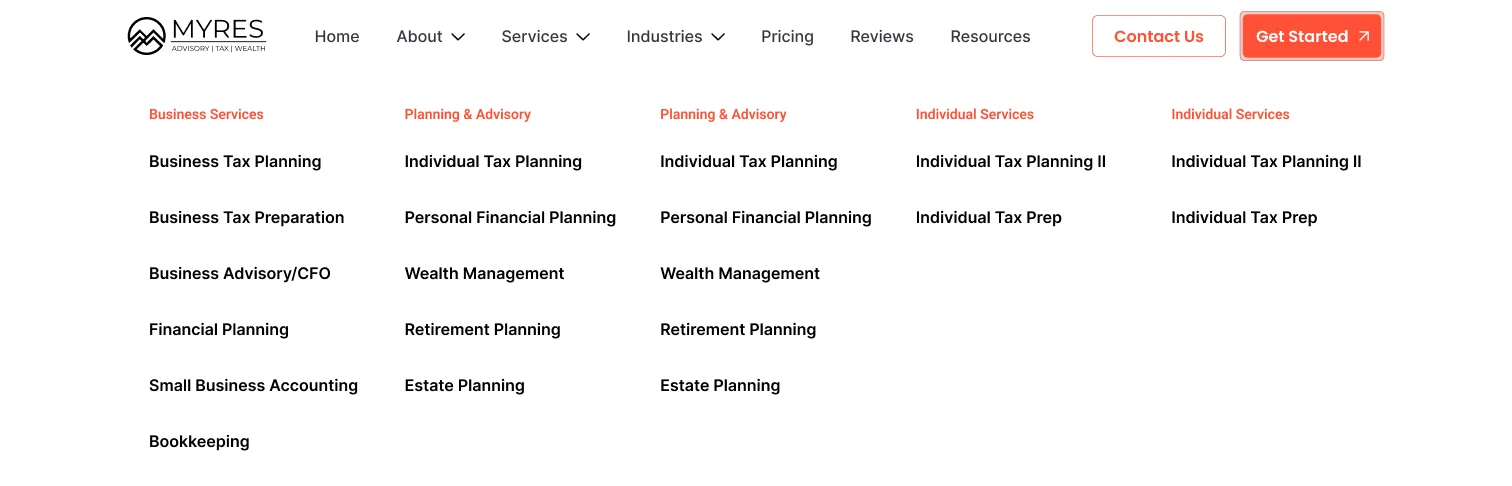
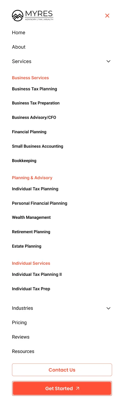
The copy team supplied the sitemap and the copy. My work was to give that structure a visual hierarchy, a navigation system and a set of reusable components that would hold together across every page template.
Approved sitemap, 19 June 2025. Prepared by the copy team; starred pages are the unique and template pages.
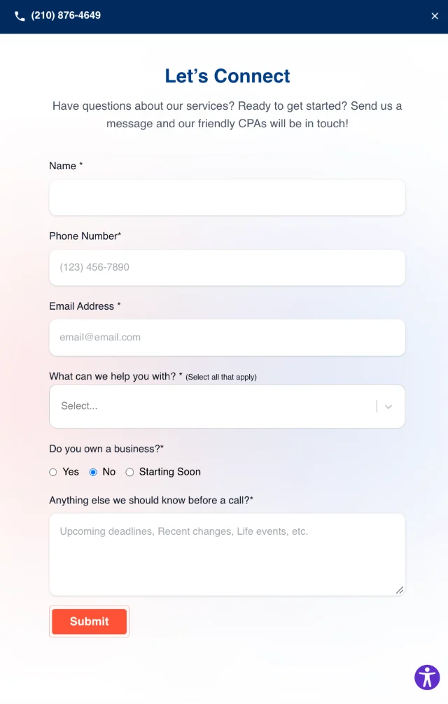
Contact panel
“Contact Us” in the header opens a full-height panel instead of sending visitors to a separate page. The phone number sits in a navy bar at the top for anyone who would rather call.
The form asks only what the firm needs before a first call: the services someone is interested in, whether they own a business, and any deadlines or life changes coming up. The orange Submit button follows the same rule as the rest of the site, with orange reserved for the next step.
Homepage hierarchy
- 01Full-bleed landscape hero: “Accounting for the business you’re BECOMING.” and “Book a Discovery Call”
- 02For Proactive Accounting Services, with the open-road image
- 03Why Business Owners Choose Myres CPA, three value cards
- 04Accounting Services That Cover Every Angle, three service group cards
- 05The Results Speak for Themselves, testimonial slider
- 06About Us with engraved team portraits
- 07Local Roots, Nationwide Reach, with the skyline
- 08Insights That Move Your Business Forward, three blog cards
- 09Financial Clarity Begins Here, the closing call to action
- 10Footer mirroring the sitemap’s footer links
Component patterns
- Service group cards. On the homepage, one card per sitemap group, each with its own orange call to action. On the San Antonio page, list rows end in an outlined arrow, and the active row turns orange and shows a “Learn More” button.
- Value cards. Three outline-icon cards, reused on the homepage and the service pages.
- Process timeline. A six-step “Myres CPA Approach” with an orange rail, used on the service templates.
- Proof and insight. A testimonial slider and three-up blog cards, ready for the CMS.
- Pricing calculator. Toggled service groups on the left and a navy estimate card on the right, following the client’s Full Send Finance reference.
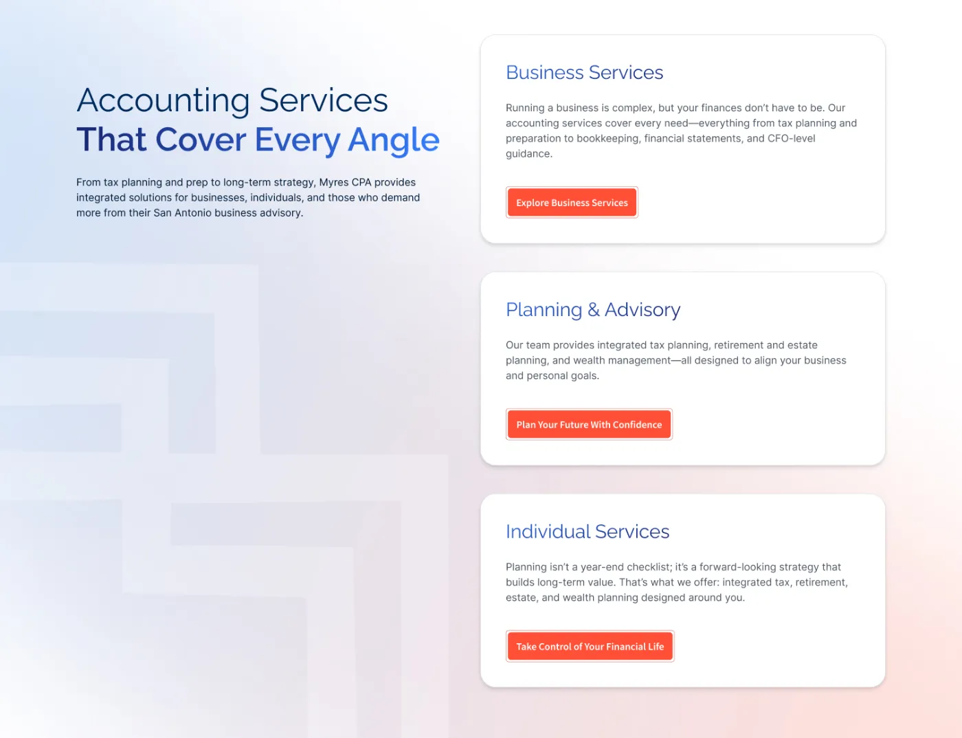
Three service groups, each with its own call to action, over the gradient with the M silhouette.
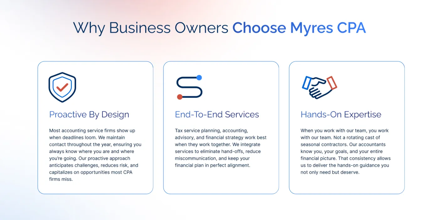
Value cards with outline icons in navy and orange.
Final designs
Desktop pages from the final files. Scroll inside each frame to see the full page.
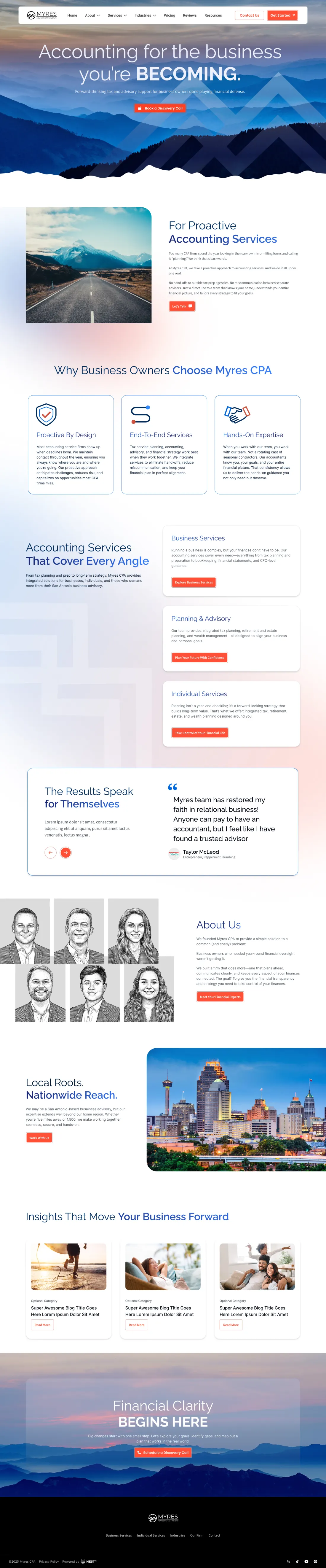


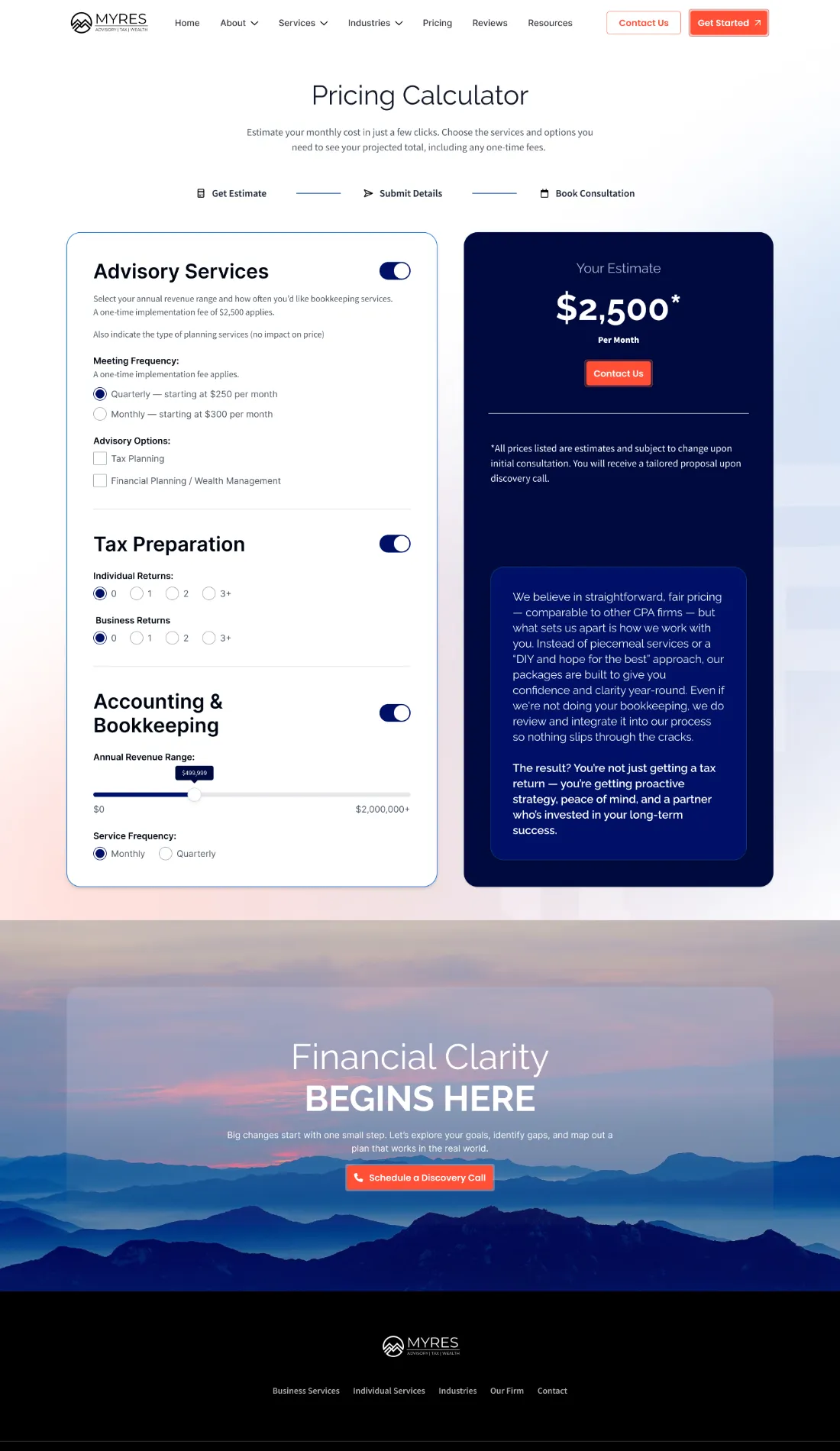
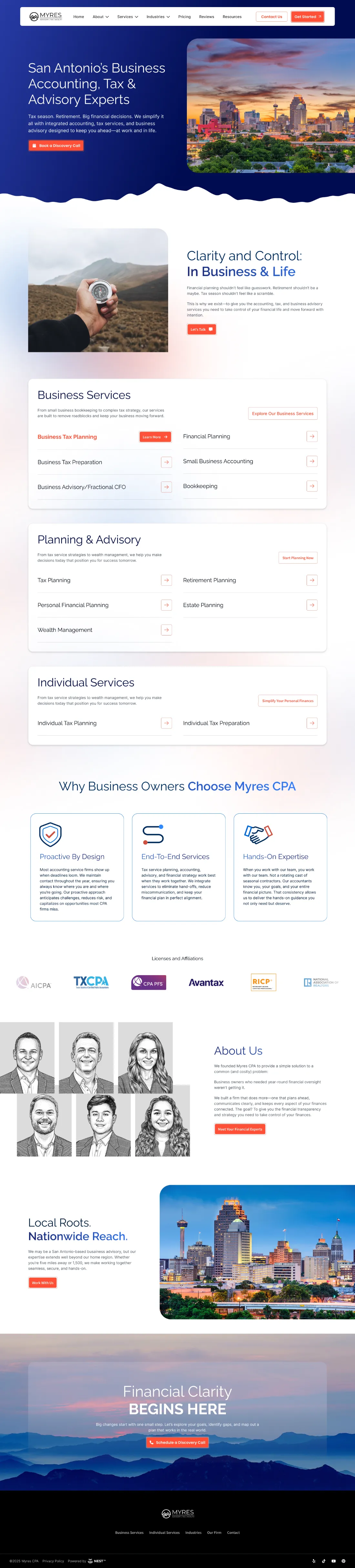
Homepage details
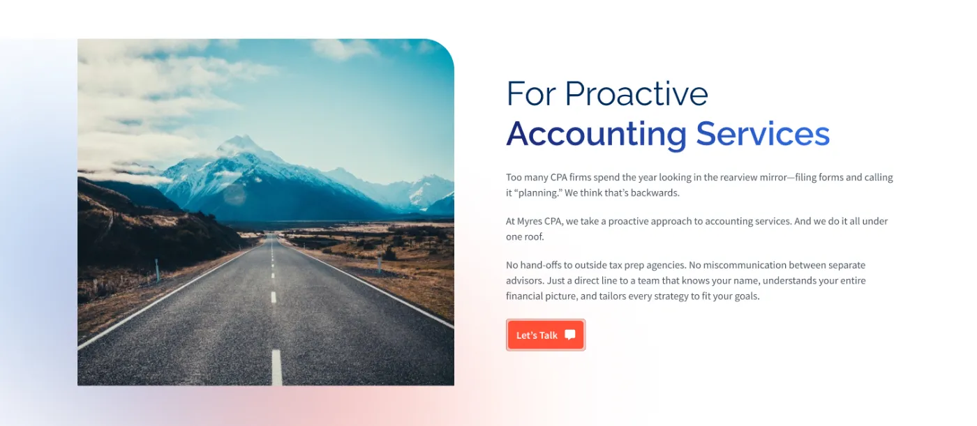
The open-road image introduces the idea of a long-term plan, framed with one rounded corner.
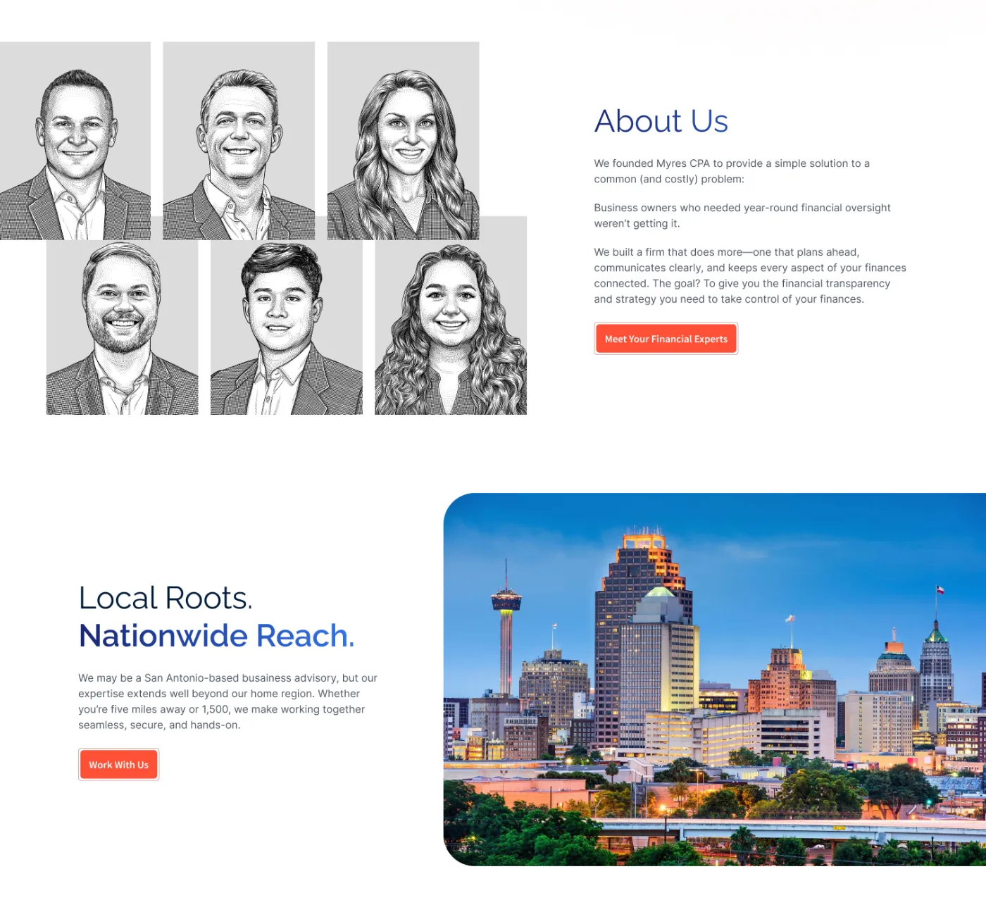
Engraved portraits give the team a consistent look without a photo shoot. The skyline bleeds off the right edge.
Responsive experience
These are the actual mobile designs at a 393px width, not desktop screens placed in a phone frame. Split sections stack with the image first, service panels become full-width lists, and the estimate card in the pricing calculator moves below the form. No tablet layouts were supplied.





San Antonio page, mobile.
The navy split hero stacks with the headline first and the skyline below it. Each service panel becomes a single-column list.
Design outcome
-
01
Visual language
Took an existing logo with no written guidelines and built a full visual language around it: palette, imagery, graphic elements and button styles, recorded on one Visual Identity Card.
-
02
Information architecture
Organised nineteen service pages in three groups into a mega menu, homepage group cards and a San Antonio page that lists every service.
-
03
Reusable templates
Designed reusable page templates (homepage, category, service and pricing calculator) on one shared set of components.
-
04
Desktop + mobile
Delivered desktop and mobile layouts for each template.
Project credits
Designed as part of my work with WISE Digital Partners.
My contribution: UI/UX design, visual design and creative direction.
Sitemap, content and copy by the WISE Digital Partners copy team. Designed in Figma and Photoshop. Photography licensed from Adobe Stock. Client: Myres CPA.