
Tiny Steps
A design system reconstructed from the homepage design for a pediatric urgent care clinic in Glendale, California, a WISE Digital Partners web project: foundations, tokens, components and the patterns they form.
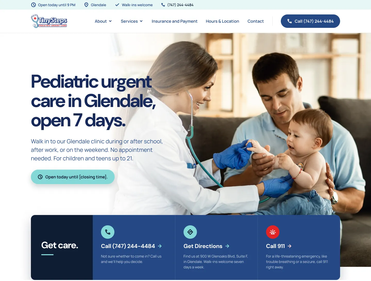
From one homepage to a system
Tiny Steps opened in Glendale in September 2026 as an urgent care built only for children and teens. The audience is a parent deciding quickly, often on a phone, whether a sick child should come in, call, or go to the ER. The homepage had to answer three questions before anything else: are you open, where are you, and is this the right place.
I wrote the creative brief for this WISE Digital Partners web project: the palette, typography, brand personality and imagery direction. Another designer on the team designed the homepage from it. I used that homepage as the reference for this reconstruction and took it apart: every color, type style, component and section pattern it uses, organized into tokens and a component library a team could build the remaining pages from.
Visible in the homepage design or stated in the creative brief.
Measured or derived from patterns that repeat across the page.
Added to complete the system. Not part of the original design.
Calm and concrete, for a parent under stress
The creative brief I wrote for the project set the tone the interface has to carry: warmth through clarity, short sentences, practical facts first. Nothing should read as clinical, corporate or cute. That brief shaped the components more than any single color did: hours, phone and the ER decision sit in the first screen, and every card leads with a plain answer.
A reassurance palette
Five brand colors come straight from the creative brief. Navy carries trust and every primary action. Aqua softens the palette toward children’s care and marks icons, rules and status. Red is reserved for urgency: the 911 path and the emergency bar. The homepage adds four supporting tones for depth and section backgrounds; I sampled those from the design.
Brand colors
OBSERVEDSupporting tones
INFERREDContrast checks
PROPOSEDDM Sans for answers, Manrope for detail
The creative brief pairs two rounded, low-contrast sans-serifs. DM Sans sets headlines tight and heavy so “open 7 days” reads at a glance. Manrope handles everything a parent reads more slowly: hours, insurance notes, symptom guidance. The scale below is measured from the 1440px homepage and rounded to a consistent ratio.
Type scale
INFERRED72 / 76 · −4%
56 / 60 · −4%
36 / 42 · −3%
22 / 28 · 0
20 / 32
16 / 26
14 / 22
13 / 16 · +12%
16 / 16
A 4px base and a 1200px frame
Spacing on the homepage lands on multiples of four: 24px card padding, 48px between a heading and its content, 96–128px between sections. The frame is a 1200px container with 120px margins at 1440, and most rows split into 12 columns.
Spacing scale
INFERREDRadius & elevation
INFERREDGrid
INFERREDThree layers, one source of truth
Primitive tokens hold raw values. Semantic tokens name the job a value does, so “action.primary” can change without touching every button. Component tokens bind those jobs to specific parts. Token names are mine; the values come from the design.
Twelve parts that build the homepage
These components cover every section of the reference homepage. Each one is rebuilt here in code from the tokens above, so the library stays in step with the system. All icons come from Font Awesome Pro.
Primary navy for the phone call, red only for emergencies, white secondary on dark or light surfaces. Pill radius, 52px height.
Live hours in the hero. Aqua so it reads as information, not as a second call to action.
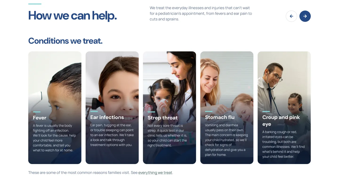
Carousel controls for conditions and reviews. The filled button marks the forward direction.
900 W Glenoaks Blvd, Suite F
Glendale, CA 91202
Address, phone and similar facts. Navy icon circle on Cloud Gray, 12px radius.
The Get care strip under the hero. Three tiles: call, directions, and 911 with a red icon circle.
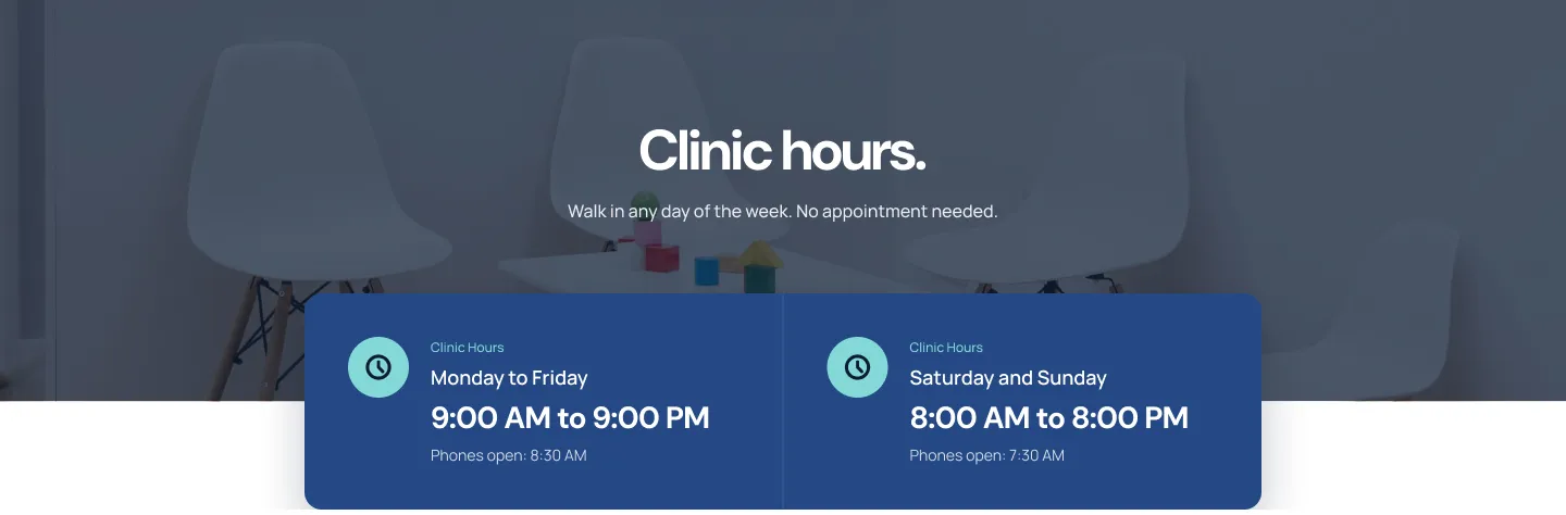
Weekday and weekend variants sit side by side and overlap the photo band above.
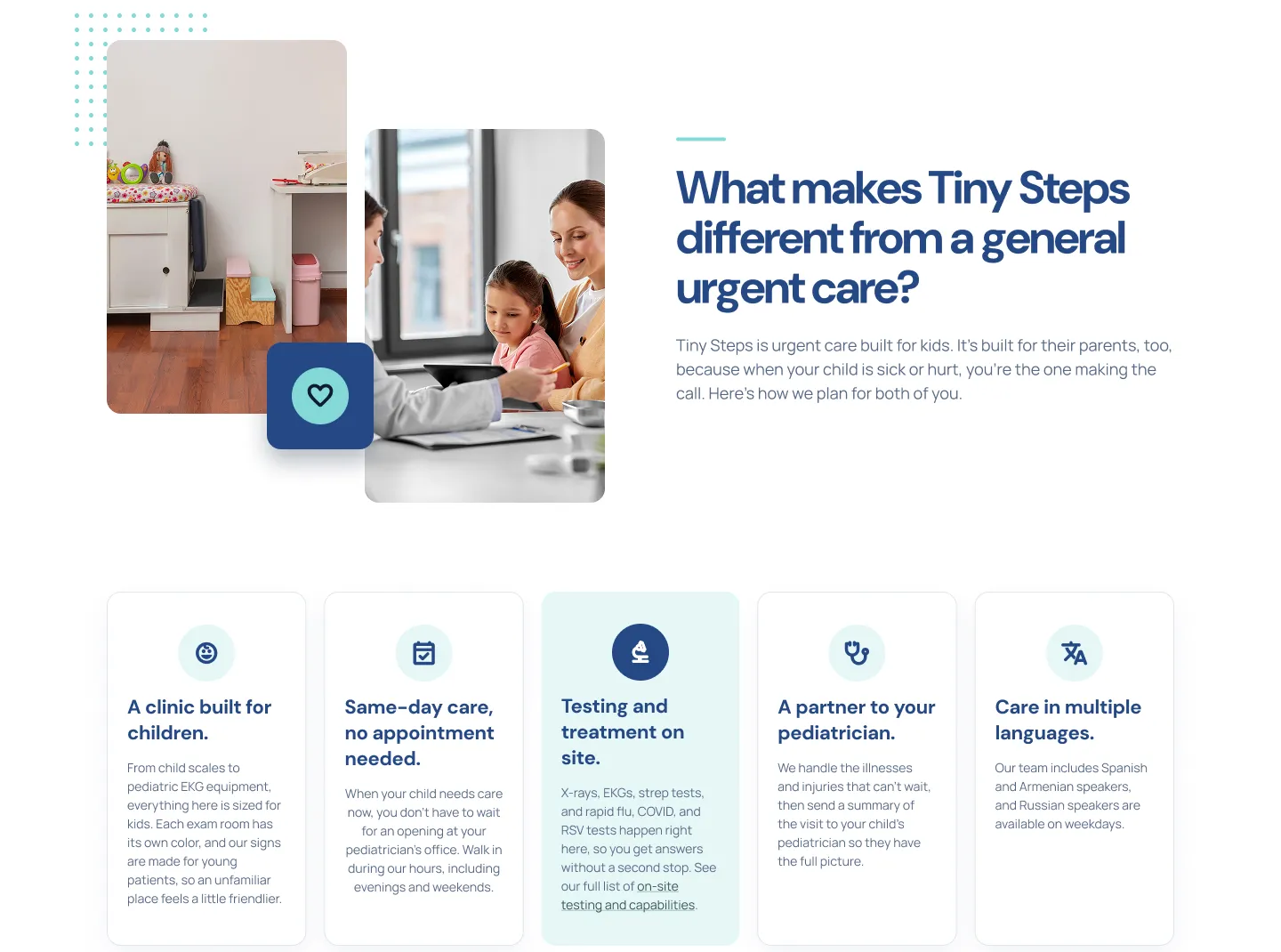
Default and highlighted variants. The highlighted card swaps to Aqua Mist with a solid navy icon.
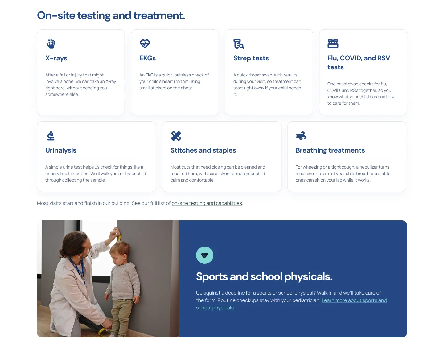
Left-aligned, with a hairline divider between title and description. Used for tests and treatments.
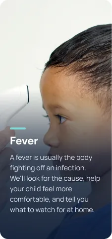

Photo cards with a navy gradient, an aqua rule and white text. Shown as cropped from the design.
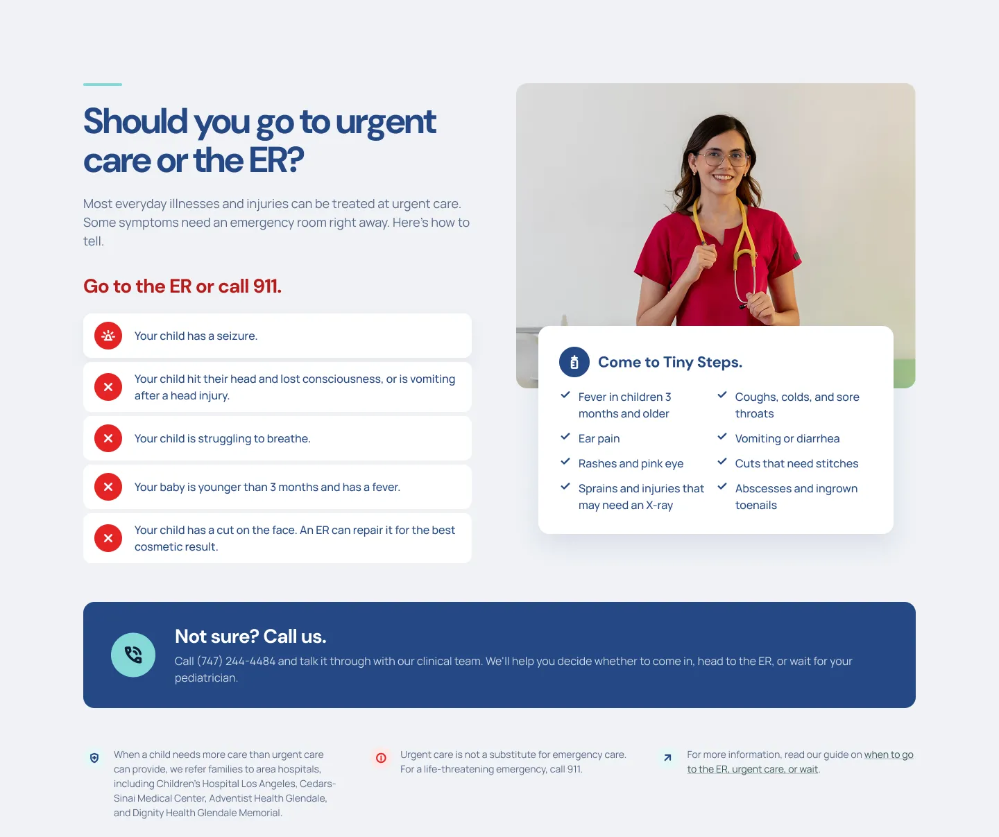
Red rows for ER symptoms, navy checks for urgent care. The two lists sit side by side so the decision is visual.
Ends the ER section with a human fallback.
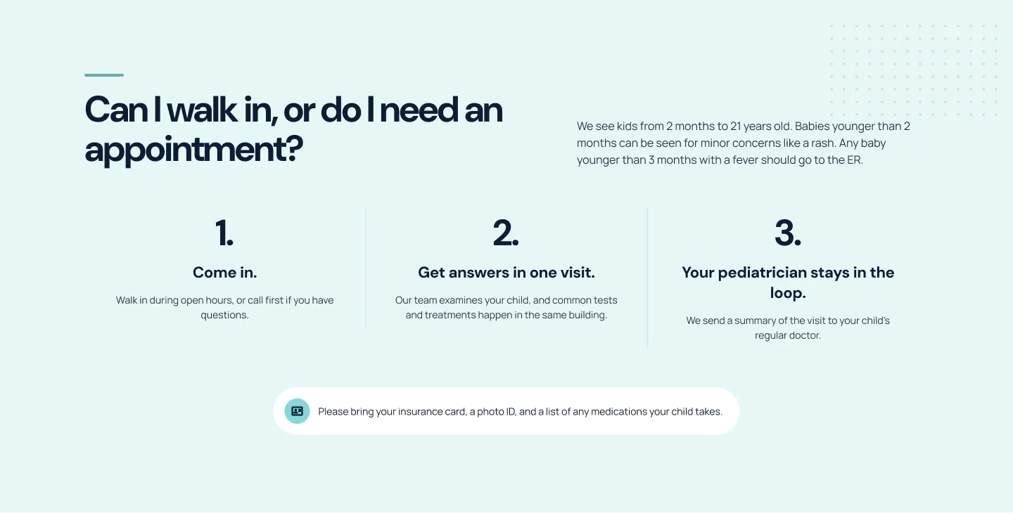
Short practical notes that follow a section. White on tinted backgrounds, tinted on white.
Font Awesome Pro icons
All icons come from Font Awesome 6 Pro. They appear in icon circles, buttons and info rows, set in Navy 600 on light surfaces.
Weights
Sample set · Regular 400
Interaction states
The homepage design shows each component at rest. Hover, focus, pressed, disabled and form states are my additions, built from the same tokens so they stay on brand. Focus uses a 3px aqua ring offset from the control, visible on white and on navy.
Primary button
PROPOSEDText input
PROPOSEDNavigation link
PROPOSEDBreakpoints and adaptation rules
Only the desktop homepage was designed in this file, so these rules are proposals, not documentation of the live mobile site. The priority stays the same at every width: the phone number and today’s hours must be reachable without scrolling.
- Layouts as designed.
- Display 72px, H2 56px.
- Get care tiles in one row of three.
- Nav collapses to a menu button; call button stays visible.
- Feature cards wrap to 3 + 2, service cards to two columns.
- Display 56px, H2 44px.
- Utility bar shows hours and phone only.
- Get care tiles stack, with Call 911 last.
- Sticky bottom bar with Call and Directions.
- Display 44px, H2 36px, body stays 16px.
How the components combine
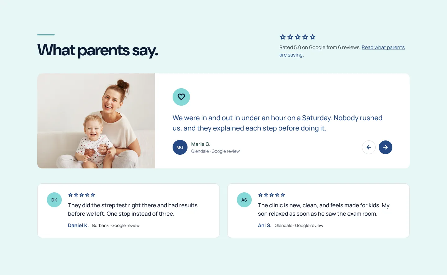
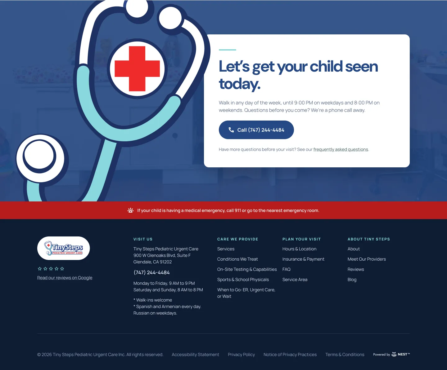
Each homepage section is a pattern assembled from the library above. Every one opens with the same aqua rule and DM Sans heading, which gives a long page a steady rhythm a parent can scan.
Project credits
Design system reconstruction based on website designs completed during my engagement with WISE Digital Partners.
My contribution: the project’s creative brief, which set the design anchors (color palette and typography), brand personality and imagery direction; and the reconstruction and documentation of this system, including tokens, the component library, proposed states and responsive rules. The homepage design was created by another designer on the WISE Digital Partners team, working from that brief.
Tiny Steps did not commission this design system; it documents how the homepage design is built. Client: Tiny Steps Pediatric Urgent Care.